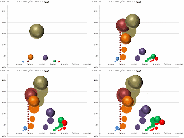
I've been fiddling with Powerpoint, figuring out how to do bubble charts with transitions.
Click on the image - it's an animated GIF. Watch how the upper salary bands change from 2003 to 2006.
The vertical axis shows the number of staff in each salary band. The size of the bubble shows the percentage of staff in each salary band as a percentage of total staff.
1 comment:
I'd love to do the same exercise with salaries in the mining industry. Not possible of course - the information is closely guarded.
Post a Comment